Connecting product discovery, checkout, and membership
Reducing the decisions between an environmental contribution and a useful member account.
People reached Plastic Bank through campaigns, ecommerce, and the website, then had to create and configure a member account. I worked with product, engineering, and marketing to connect those entry points with a clearer first-use experience.
At a glance
- 4.5% → 13.3%
- Reported acquisition ratio
- +32%
- Monthly subscription revenue
- 36% → 45%
- Subscription share of revenue
Problem
Interest wasn’t reliably becoming membership
PostHog showed people reaching onboarding and dropping out. A visitor responding to an environmental campaign could immediately face account types, passwords, business setup, and customization tools before understanding why those decisions mattered.

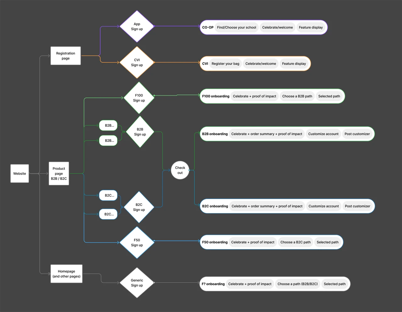
 Personal and business members needed different paths through account setup.
Process
Carry the reason for joining into setup
I reviewed the journey with product, engineering, and marketing. Membership was required during checkout, but the reason for joining was not always carried into account setup. Business members also needed context before they could use the communication and customization tools.
I focused the redesign on preserving the visitor’s intent: explain the contribution or business benefit first, then ask for the information needed to continue.

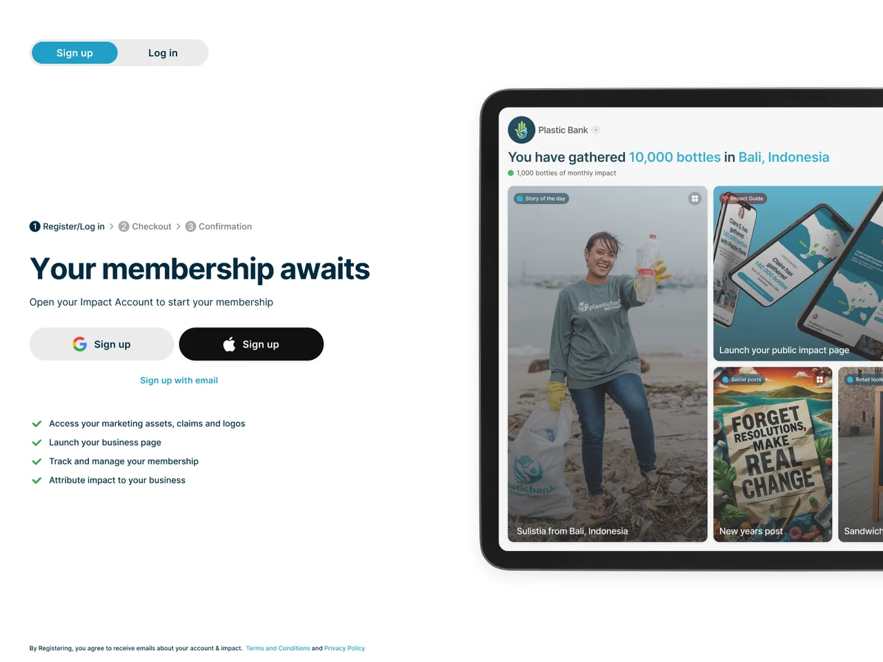 Membership was part of checkout, so the product needed to explain its value before requiring an account.
Design work
Make the value clear before asking for effort
For business members, onboarding introduced the impact benefits before customization. Personal members followed a lighter initial path, with additional capabilities introduced when relevant.
I reduced repeated inputs and worked with engineering as authentication evolved, including Google sign-in. These changes addressed account-creation effort alongside the clearer explanation of membership.

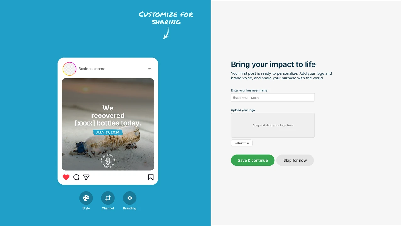 “Show, don’t tell”: introduce the value before asking people to configure it.
Beyond onboarding
Give members a useful starting point
The same approach carried into the account. I simplified navigation, clarified the relationship between personal and business accounts, and grouped impact, guidance, and features on a flexible homepage. Members could find a starting point without configuring every tool at once.

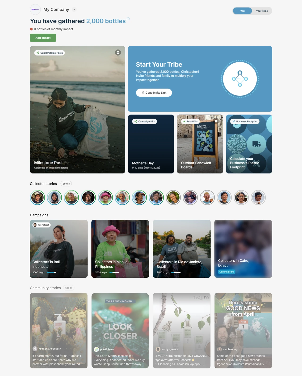 The member homepage grouped impact, guidance, and product features into a flexible starting point.
Results
Stronger acquisition and subscription revenue
Internal reporting recorded a 4.5% → 13.3% acquisition ratio, +32% monthly subscription revenue, and subscription revenue share rising from 36% to 45%. The ratio compares new accounts with engaged home and campaign visitors; revenue uses a broader reporting window.
Retail network sales also drove growth, so these trends do not isolate the effect of the designs shown here. They provide business context for a shared growth effort; my contribution was the journey, account structure, and iteration informed by product data.

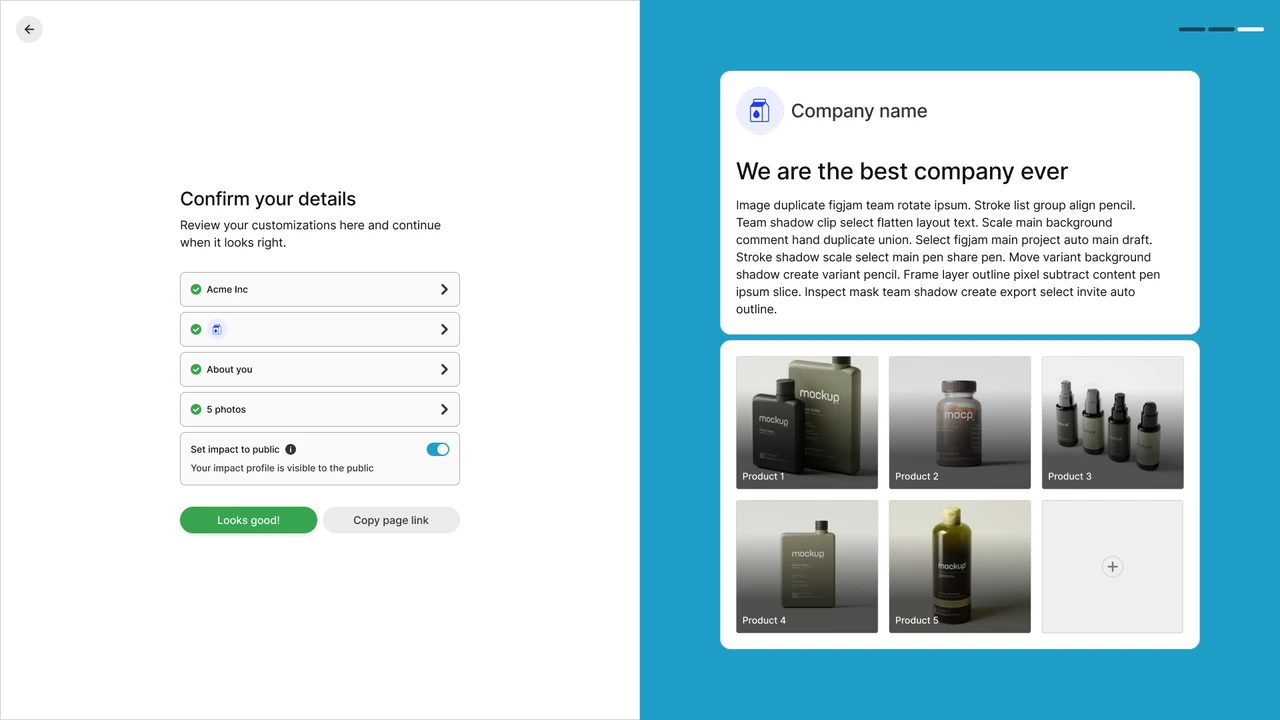 We gave customization and control to users early.
