Creating a shared design system for five products
Shared components and rules for mobile, web, and operational products.
Plastic Bank’s products served collectors, operations teams, clients, and members, but each team was solving common interface problems independently. As Design Lead and primary UI/UX owner, I built a shared system and established how it would evolve.
At a glance
- 5 products
- One shared design system
- Hundreds
- Reusable components and patterns
- Production reuse
- Shared components in code
Problem
Common controls kept being reinvented
Buttons, forms, navigation, and data displays were repeatedly redesigned or interpreted differently. Similar controls behaved differently across products, and developers had to resolve decisions that design had already made elsewhere.

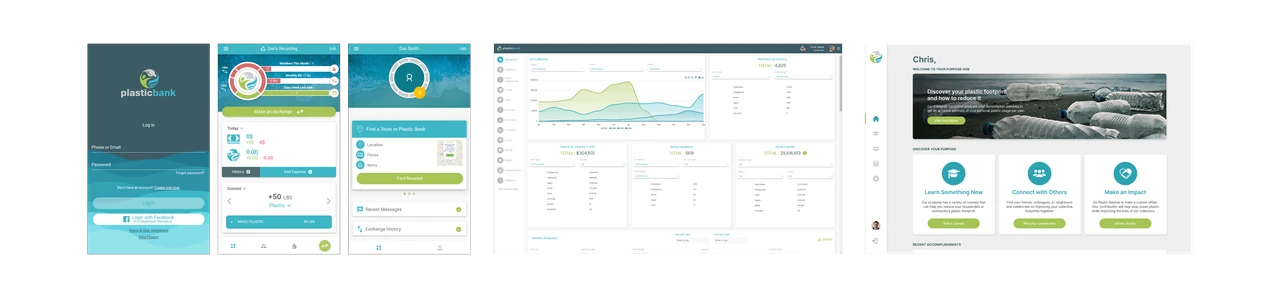
 Mobile, operational, and consumer products had developed separate interface patterns.
System
Define the rules before expanding the library
I started with colour, typography, and spacing rules, then built semantic tokens, reusable components, and patterns for forms, navigation, data, and transactions. These foundations made common behaviour explicit before the library grew.

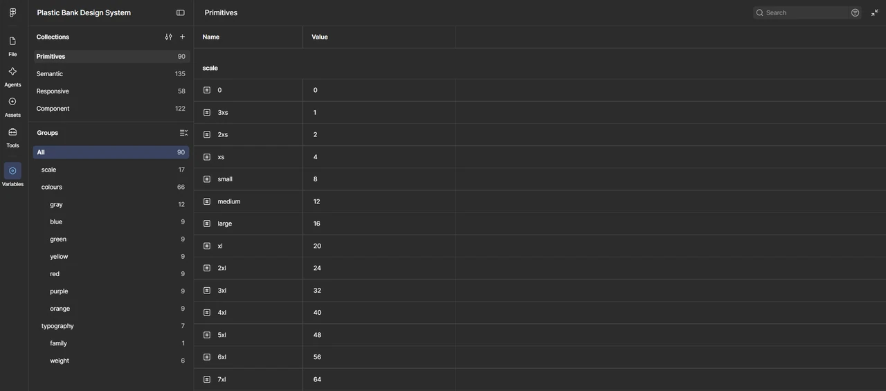 Semantic tokens defined how colour, typography, and spacing should be used.
The hard part
Standardize behaviour, allow product differences
I kept interaction behaviour, accessibility, component anatomy, and states consistent while allowing density, hierarchy, and layout to vary. Dense operational tools needed a neutral interface around status colours; consumer products needed more space for brand and content.
The mobile app also had to accommodate different languages, devices, and connectivity. Shared foundations had to support those conditions without prescribing the same screen everywhere.

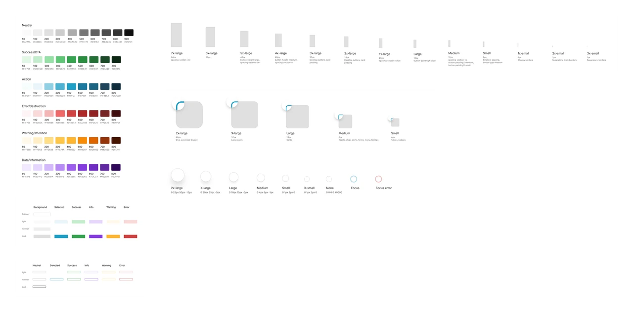 Shared foundations supported different interface densities and product needs.
Design ↔ Build
Carry the rules into code
I worked with developers on component behaviour, responsive states, naming, and framework constraints, including reviewing the library against Ionic during the mobile migration. Reusable code components and Storybook brought implementation and visual review into the system.
Governance
Give new components a reason to exist
For each new requirement, I checked whether an existing pattern could handle it, needed an extension, or should remain specific to one product. That gave the library a clear rule for growth instead of absorbing every request as a new component.

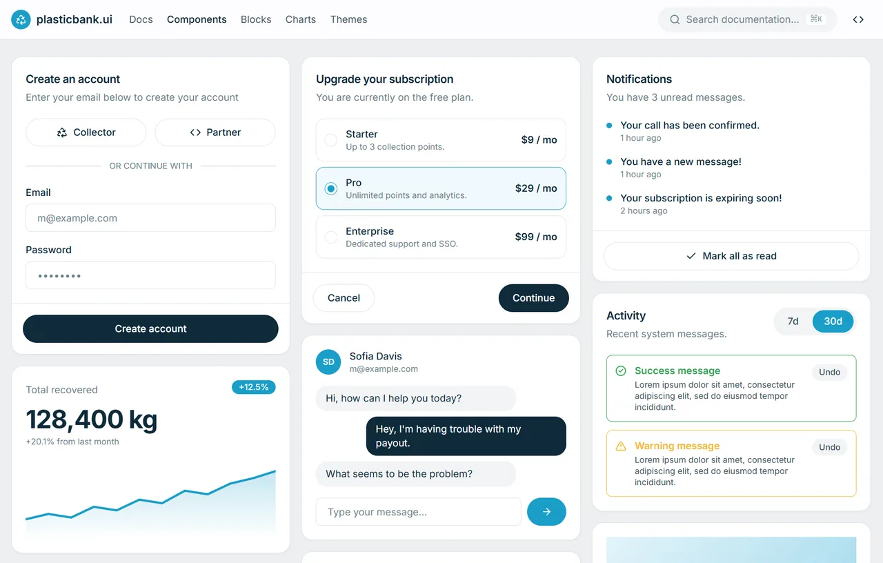 Eventually the atoms add up. Reusable patterns made my life—and the next designer’s—easier.
Outcome
One system supporting five products
The system became a shared foundation across five products, with hundreds of components, variants, and patterns. Adoption extended into reusable production components and Storybook, so teams could build and review interfaces against the same rules.
The work later informed the delivery agreements in the Design Ops case: requirements, design, and implementation needed to carry the same intent.
